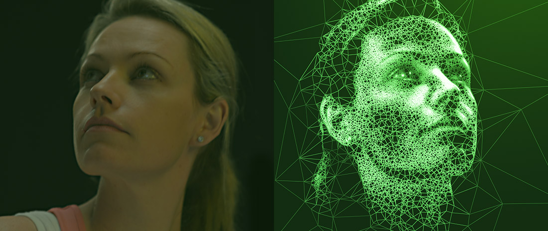
To accompany the three videos we produced for the launch of Enhanced Media Metrics Australia (EMMA) we also developed three print designs, as well as a software application that could be used by the agency to generate further designs in the future. Like the videos, the prints show a person emerging from an abstract world of statistics. Form from data. The work needed to be reproducible across a range of print media, from newspapers to glossy magazines.
We developed software that analysed photographic portraits of the models to generate a 2D mesh-like interpretation that reflected the technical capabilities of the EMMA system while producing an image that was still instantly human, familiar, recognisable as the same person featured in the corresponding video and avoiding the uncanny valley.
“EMMA has been developed using the most innovative methodology and technology so it’s only fitting that our marketing campaign also draws on the freshest data-based techniques.” – Lucia Elliott, Marketing Director, The Newspaper Works
September 2013
Client: GoodOil, The Hallway
“Data-Driven Masterpieces”
Generation
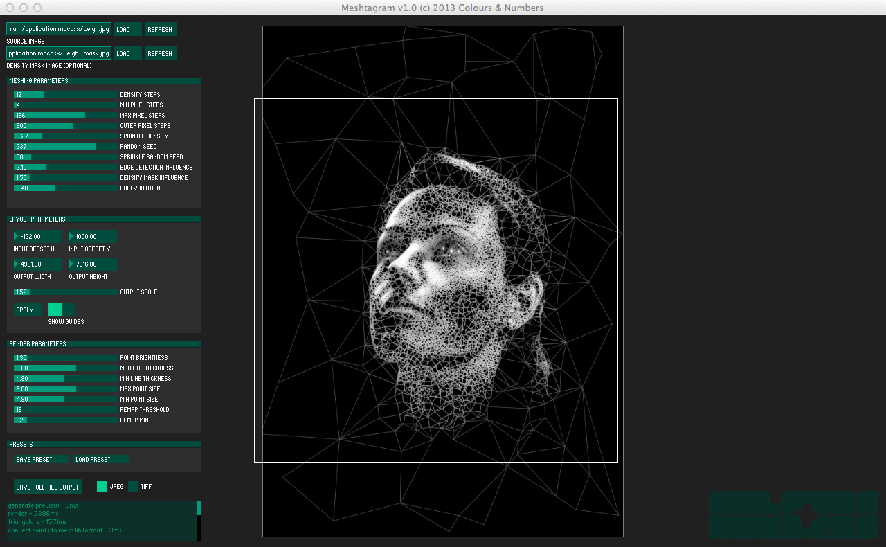
The technique to generate the images involved several stages. Firstly the software did edge detection on the input photograph. To do this we implemented a Sobel filter which corresponded exactly to “Find Edges” in Photoshop (so that it would behave in a way familiar to designers). This edge-detected image was stored internally for use in a later stage. Secondly, the software seeded the canvas with points which would be later used to create a modified Delaunay triangulation. The manner in which the seed points were chosen was crucial to achieving a natural feel in the final result. Brighter areas in the source photo would receive more points, while darker areas would receive fewer points. We added control over the “smoothness” of the point density change between bright and dark areas, effectively giving us a point-based analogue of a contrast control. Points were placed on a uniform grid but with a random offset to allow variation in how ordered vs. organic the final result would feel. The resulting triangulation was then further processed by removing triangles that were too acute, removing edges that were too long (giving us a modified Urquhart graph) and several other heuristics to fine-tune the algorithm for processing human faces.
This graph was then rendered with points and lines whose weight and brightness were determined by the intensity of the input photo. An optional additional image could be specified that influenced the density and brightness, allowing us to finesse the final result if necessary. The Meshtagram software we developed made all of these parameters adjustable, and allowed the whole setup for each design to be saved and loaded. This allowed us to respond to client feedback very rapidly and iterate internally to quickly zero in on the desired result.
Following completion of the print designs we released Meshtagram to the agency so that they could use it to generate additional designs in the future, and extend the campaign. But our approach in general is to develop polished user-oriented software even for internal use only, since the extra design and development effort is greatly outweighed by the downstream benefits of decreased iteration times and flexibility to accommodate our clients and give them the best result possible.


